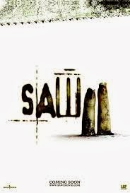
The
setting of the poster is extremely plain and unconventional as it is a simple,
nondescript, white background. Usually the setting or background for a horror
film poster is dark or features an isolated setting which links to the film. However,
this poster may have used a simple white background because it is a teaser; it
doesn’t want to give as much away about the film’s narrative as a usual poster
would do, so they cannot try and guess the narrative of this sequel. Or
perhaps, as this poster is for the sequel to Saw, the audience do not need any further information to make sense
of the poster and make assumptions about the narrative. The effectiveness of
the stark white background cannot be argued, meanwhile. It works and is fitting
that it is so cold and sterile, whilst the white background allows the lopped
off fingers to stand more starkly and sinisterly. The white background also
links back to the first Saw movie, in
which the poster was a single hand on a white, clinical looking floor – it
signals that it is a sequel and creates a symbiotic link. This symbiosis is
important, as it increases recognisability. Fans of the previous Saw movie will identify very quickly
that this is the second installment of Saw
and will be instantly drawn to it. The white background could also signal the
fact that the narrative of the Saw movies is very basic, as, in each one we see
someone have to risk their own lives in order to save their life – simple as
that. Equally, the white background reflects the fact that the Saw franchise is a psychological horror
which is a sub-genre which is not as mainstream as say, slasher or supernatural
– the Saw movies like to break
boundaries. It’s rare to see a horror poster with a white background; just like
psychological horrors are less common nowadays. Thus the background signals the
film isn’t like other horror films – it is different when it comes to
sub-genre.
However,
despite the unique quality of the poster, it does follow the conventions of
horror movie posters, as we see the name of the movie as the largest piece of
text in the frame and it is located in the middle. It is also a script type font
which is a common convention for psychological horrors; they tend to get inside
a character’s mind and therefore they are much more personal than other
sub-genres and the script font reflects this. The fact that ‘COMING SOON’
features on the poster is a convention in itself and is indicative of how the
poster is a teaser poster; teasers aim to create interest and intrigue and do
not give the actual release date away.
The
image features two fingers that have been severed off and look unclean and as
if they are decomposing. This will instantly horrify and disgust the audience,
particularly as they can see congealed blood sitting beneath the fingers and
split nails sitting on top. Above the name and the image, which are placed next
to each other, we see the edge of a saw at the top of the poster. The saw anchors
the audience’s understanding of the other parts of the image – the audience
will first see the edge of the saw, look down, and see the severed fingers and
will realise that the fingers have been sawed off. This gives the poster an interactive element
when it comes to the audience, as the audience have to figure out why the
fingers are there, and once they do they will feel clever and engaged when it
comes to the film poster and therefore this may entice more audience members to
come and see the movie. It also attracts the perfect target audience;
psychological horrors tend to attract an intellectual audience who like movies that
challenge their mind. It may also send a chill down the audience’s spine as,
with both the fingers and the saw there they will imagine the fingers being
sawn off; a gross image. If a poster is able to do this to a horror audience,
who could be partial to a good scare and even a bit of gore, then the audience
may wonder whether the film is just as scary and gruesome and will again be
encouraged to watch it. It is unclear as to which lighting has been used; it
appears to be available lighting or artifcial, but either way it is bright,
thus emphasising the white floor, the horrific and decaying nature of the
fingers, the tarnished writing and the dirty saw and will definitely put the
audience on edge even more as they may feel they can’t escape it – it’s in
their face.
The
severed fingers that feature within this poster are extremely dirty and the chipped
fingernails look long and brittle. These are key to making the audience feel
uncomfortable; the fingers are so dirty, it begs the question, where were they
chopped off and why are they so filthy? Also, how long have they been there, as
they certainly look decomposed? Who do they belong to, where is the rest of him
or her and are they still alive? This leaves the audience full of intrigue. The
long fingernails being chipped and filthy also add to the eerie, spinechilling
feel of the poster, and the audience will be wondering why are they so long and
how were they chipped? The split, chipped look of the nails could even be said
to be symbolic. One of the nails is split in two, symbolising the way in which
the fingers have been ‘split’ away from the remaining parts of their owner,
while the overall grotesque state of the nails mimics the hideousness of the
fingers generally and reflects the nastiness of the actual crime. The fact the
fingers are also unclean also signal it is a horror; these clearly weren’t
removed by a doctor at a hospital as part of a supervised procedure. The saw
also looks tarnished and this is classic horror iconography. All of these
elements combine to create a sense of fear, disgust and curiousity for the
audience and encourage them further to go and see the film. The fact that the image makes so many
questions pop up in the audience’s mind could also be reflective of the fact it
is a psychological horror being advertised; although it features severed
fingers and a saw, a typical horror weapon, it doesn’t really follow slasher
conventions with a masked antagonist featured or a bloodied knife.
The
title of the film itself, Saw 2,
suggests that the movie will be gory, but doesn’t really give too much away,
such as the sub-genre it belongs to. However, the fact it is a sequel (hence
the ‘2’ in the name) plays a big role as the audience will be likely to have
seen the first movie within the horror franchise, and will therefore have an
idea about the kind of narrative that will feature. The title does, however,
match the movie as after all, it is extremely gory as well as being a clever,
psychological horror. The name also provides further anchorage as it makes sure
the audience know that the fingers have been sawn off. The script font that is
used isn’t very conventional; it looks as if somebody has used a hot poker or
some sort of marker to put the letters onto the poster, which, again,
reinforces the gory idea of the movie. The large font also makes it grab the
audience’s attention, along with the brown colour and tarnished effect against
the white background. The brown colour and tarnished letters also link to the
fingers, which are of a similar colour and have a similar, worn effect – both
the text and the image seem filthy. The longer, vertical parts of the letter
‘W’ seem to mimic either the shape of sawn off fingers or even the shape of the
saw’s edge itself, creating a very effective title. Typically,the large size of
the text also signifies it is the name of the film, following conventions and
also making it highly visible compared to the ‘COMING SOON’ piece of text at
the bottom of the page. Usually the name of the film features at the bottom. However,
when looking at teaser posters, it tends to feature in the middle, leaving the
bottom free for release-related information.
The
colours which tend to dominate the poster is white and dark brown; this could
reflect the battle between life and death which the characters within the movie
face or even the battle between good and evil that sits at the very centre of
all horror narratives. The white also contrasts with the brown, dirtiness of
the fingers and name, therefore making the audience feel even more
uncomfortable as the fingers and name really stand out.
In
conclusion, this teaser poster is extremely effective in promoting Saw 2; it creates the right amount of
intrigue to lure in its target audience through its simple use of image and
mise-en-scene. As it is a sequel, the audience will already know the basic narrative
of the move, but, nevertheless, the saw at the top of the poster and sawn off fingers
also suggest the narrative without giving too much away for the audience.
No comments:
Post a Comment